logo
EverydayChaos
Everyday Chaos
Too Big to Know
Too Big to Know
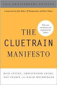
Cluetrain 10th Anniversary edition
Cluetrain 10th Anniversary
Everything Is Miscellaneous
Small Pieces cover
Small Pieces Loosely Joined
Cluetrain cover
Cluetrain Manifesto
My face
Speaker info
Who am I? (Blog Disclosure Form) Copy this link as RSS address Atom Feed

February 1, 2018

Can AI predict the odds on you leaving the hospital vertically?

A new research paper, published Jan. 24 with 34 co-authors and not peer-reviewed, claims better accuracy than existing software at predicting outcomes like whether a patient will die in the hospital, be discharged and readmitted, and their final diagnosis. To conduct the study, Google obtained de-identified data of 216,221 adults, with more than 46 billion data points between them. The data span 11 combined years at two hospitals,

That’s from an article in Quartz by Dave Gershgorn (Jan. 27, 2018), based on the original article by Google researchers posted at Arxiv.org.

…Google claims vast improvements over traditional models used today for predicting medical outcomes. Its biggest claim is the ability to predict patient deaths 24-48 hours before current methods, which could allow time for doctors to administer life-saving procedures.

Dave points to one of the biggest obstacles to this sort of computing: the data are in such different formats, from hand-written notes to the various form-based data that’s collected. It’s all about the magic of interoperability … and the frustration when data (and services and ideas and language) can’t easily work together. Then there’s what Paul Edwards, in his great book A Vast Machine calls “data friction”: “…the costs in time, energy, and attention required simply to collect, check, store, move, receive, and access data.” (p. 84)

On the other hand, machine learning can sometimes get past the incompatible expression of data in a way that’s so brutal that it’s elegant. One of the earlier breakthroughs in machine learning came in the 1990s when IBM analyzed the English and French versions of Hansard, the bi-lingual transcripts of the Canadian Parliament. Without the machines knowing the first thing about either language, the system produced more accurate results than software that was fed rules of grammar, bilingual dictionaries, etc.

Indeed, the abstract of the Google paper says “Constructing predictive statistical models typically requires extraction of curated predictor variables from normalized EHR data, a labor-intensive process that discards the vast majority of information in each patient’s record. We propose a representation of patients’ entire, raw EHR records based on the Fast Healthcare Interoperability Resources (FHIR) format. ” It continues: “We demonstrate that deep learning methods using this representation are capable of accurately predicting multiple medical events from multiple centers without site-specific data harmonization.”

The paper also says that their approach affords clinicians “some transparency into the predictions.” Some transparency is definitely better than none. But, as I’ve argued elsewhere, in many instances there may be tools other than transparency that can give us some assurance that AI’s outcomes accord with our aims and our principles of fairness.


I found this article by clicking on Dave Gershgon’s byline on a brief article about the Wired version of the paper of mine I referenced in the previous paragraph. He does a great job explaining it. And, believe me, it’s hard to get a writer — well, me, anyway — to acknowledge that without having to insert even one caveat. Thanks, Dave!

Tweet
Follow me

Categories: ai, interop Tagged with: 2b2k • data • explanations • interop • machine learning Date: February 1st, 2018 dw

Be the first to comment »

September 26, 2017

[lliveblog][PAIR] Antonio Torralba on machine vision, human vision

At the PAIR Symposium, Antonio Torralba asks why image identification has traditionally gone so wrong.

NOTE: Live-blogging. Getting things wrong. Missing points. Omitting key information. Introducing artificial choppiness. Over-emphasizing small matters. Paraphrasing badly. Not running a spellpchecker. Mangling other people’s ideas and words. You are warned, people.

If we train our data on Google Images of bedrooms, we’re training on idealized photos, not real world. It’s a biased set. Likewise for mugs, where the handles in images are almost all on the right side, not the left.

Another issue: The CANNY edge detector (for example) detects edges and throws a black and white reduction to the next level. “All the information is gone!” he says, showing that a messy set of white lines on black is in fact an image of a palace. [Maybe the White House?] (A different example of edge detection:)

/div>

Deep neural networks work well, and can be trained to recognize places in images, e.g., beach. hotel room, street. You train your neural net and it becomes a black box. E.g., how can it recognize that a bedroom is in fact a hotel room? Maybe it’s the lamp? But you trained it to recognize places, not objects. It works but we don’t know how.

When training a system on place detection, we found some units in some layers were in fact doing object detection. It was finding the lamps. Another unit was detecting cars, another detected roads. This lets us interpret the neural networks’ work. In this case, you could put names to more than half of the units.

How to quantify this? How is the representation being built? For this: Network dissection. This shows that when training a network on places, objects emerges. “The network may be doing something more interesting than your task.”The network may be doing something more interesting than your task: object detection is harder than place detection.

We currently train systems by gathering labeled data. But small children learn without labels. Children are self-supervised systems. So, take in the rgb values of frames of a movie, and have the system predict the sounds. When you train a system this way, it kind of works. If you want to predict the ambient sounds of a scene, you have to be able to recognize the objects, e.g., the sound of a car. To solve this, the network has to do object detection. That’s what they found when they looked into the system. It was doing face detection without having been trained to do that. It also detects baby faces, which make a different type of sound. It detects waves. All through self-supervision.

Other examples: On the basis of one segment, predict the next in the sequence. Colorize images. Fill in an empty part of an image. These systems work, and do so by detecting objects without having been trained to do so.

Conclusions: 1. Neural networks build represntations that are sometimes interpretatble. 2. The rep might solve a task that’s evem ore interesting than the primary task. 3. Understanding how these reps are built might allow new approaches for unsupervised or self-supervised training.

Tweet
Follow me

Categories: ai, liveblog Tagged with: ai • data • machine learning Date: September 26th, 2017 dw

Be the first to comment »

June 25, 2016

TED, scraped

TED used to have an open API. TED no longer supports its open API. I want to do a little exploring of what the world looks like to TED, so I scraped the data from 2,228 TED Talk pages. This includes the title, author, tags, description, link to the transcript, number of times shared, and year. You can get it from here. (I named it tedTalksMetadata.txt, but it’s really a JSON file.)

“Scraping” means having a computer program look at the HTML underneath a Web page and try to figure out which elements refer to what. Scraping is always a chancy enterprise because the cues indicating which text is,say, the date and which is the title may be inconsistent across pages, and may be changed by the owners at any time. So I did the best I could, which is not very good. (Sometimes page owners aren’t happy about being scraped, but in this case it only meant one visit for each page, which is not a lot of burden for a site that has pages that get hundreds of thousands and sometimes millions of visits. If they really don’t want to be scraped, they could re-open their API, which provides far more reliable info far more efficiently.)

I’ve also posted at GitHub the php scripts I wrote to do the scraping. Please don’t laugh.

If you use the JSON to explore TED metadata, please let me know if you come up with anything interesting that you’re willing to share. Thanks!

Tweet
Follow me

Categories: tech Tagged with: data • TED Date: June 25th, 2016 dw

Be the first to comment »

February 14, 2013

[2b2k] The public ombudsman (or Facts don’t work the way we want)

I don’t care about expensive electric sports cars, but I’m fascinated by the dustup between Elon Musk and the New York Times.

On Sunday, the Times ran an article by John Broder on driving the Tesla S, an all-electric car made by Musk’s company, Tesla. The article was titled “Stalled Out on Tesla’s Electric Highway,” which captured the point quite concisely.

Musk on Wednesday in a post on the Tesla site contested Broder’s account, and revealed that every car Tesla lends to a reviewer has its telemetry recorders set to 11. Thus, Musk had the data that proved that Broder was driving in a way that could have no conceivable purpose except to make the Tesla S perform below spec: Broder drove faster than he claimed, drove circles in a parking lot for a while, and didn’t recharge the car to full capacity.

Boom! Broder was caught red-handed, and it was data that brung him down. The only two questions left were why did Broder set out to tank the Tesla, and would it take hours or days for him to be fired?

Except…

Rebecca Greenfield at Atlantic Wire took a close look at the data — at least at the charts and maps that express the data — and evaluated how well they support each of Musk’s claims. Overall, not so much. The car’s logs do seem to contradict Broder’s claim to have used cruise control. But the mystery of why Broder drove in circles in a parking lot seems to have a reasonable explanation: he was trying to find exactly where the charging station was in the service center.

But we’re not done. Commenters on the Atlantic piece have both taken it to task and provided some explanatory hypotheses. Greenfield has interpolated some of the more helpful ones, as well as updating her piece with testimony from the tow-truck driver, and more.

But we’re still not done. Margaret Sullivan [twitter:sulliview] , the NYT “public editor” — a new take on what in the 1960s we started calling “ombudspeople” (although actually in the ’60s we called them “ombudsmen”) — has jumped into the fray with a blog post that I admire. She’s acting like a responsible adult by witholding judgment, and she’s acting like a responsible webby adult by talking to us even before all the results are in, acknowledging what she doesn’t know. She’s also been using social media to discuss the topic, and even to try to get Musk to return her calls.

Now, this whole affair is both typical and remarkable:

It’s a confusing mix of assertions and hypotheses, many of which are dependent on what one would like the narrative to be. You’re up for some Big Newspaper Schadenfreude? Then John Broder was out to do dirt to Tesla for some reason your own narrative can supply. You want to believe that old dinosaurs like the NYT are behind the curve in grasping the power of ubiquitous data? Yup, you can do that narrative, too. You think Elon Musk is a thin-skinned capitalist who’s willing to destroy a man’s reputation in order to protect the Tesla brand? Yup. Or substitute “idealist” or “world-saving environmentally-aware genius,” and, yup, you can have that narrative too.

Not all of these narratives are equally supported by the data, of course — assuming you trust the data, which you may not if your narrative is strong enough. Data signals but never captures intention: Was Broder driving around the parking lot to run down the battery or to find a charging station? Nevertheless, the data do tell us how many miles Broder drove (apparently just about the amount that he said) and do nail down (except under the most bizarre conspiracy theories) the actual route. Responsible adults like you and me are going to accept the data and try to form the story that “makes the most sense” around them, a story that likely is going to avoid attributing evil motives to John Broder and evil conspiratorial actions by the NYT.

But the data are not going to settle the hash. In fact, we already have the relevant numbers (er, probably) and yet we’re still arguing. Musk produced the numbers thinking that they’d bring us to accept his account. Greenfield went through those numbers and gave us a different account. The commenters on Greenfield’s post are arguing yet more, sometimes casting new light on what the data mean. We’re not even close to done with this, because it turns out that facts mean less than we’d thought and do a far worse job of settling matters than we’d hoped.

That’s depressing. As always, I am not saying there are no facts, nor that they don’t matter. I’m just reporting empirically that facts don’t settle arguments the way we were told they would. Yet there is something profoundly wonderful and even hopeful about this case that is so typical and so remarkable.

Margaret Sulllivan’s job is difficult in the best of circumstances. But before the Web, it must have been so much more terrifying. She would have been the single point of inquiry as the Times tried to assess a situation in which it has deep, strong vested interests. She would have interviewed Broder and Musk. She would have tried to find someone at the NYT or externally to go over the data Musk supplied. She would have pronounced as fairly as she could. But it would have all been on her. That’s bad not just for the person who occupies that position, it’s a bad way to get at the truth. But it was the best we could do. In fact, most of the purpose of the public editor/ombudsperson position before the Web was simply to reassure us that the Times does not think it’s above reproach.

Now every day we can see just how inadequate any single investigator is for any issue that involves human intentions, especially when money and reputations are at stake. We know this for sure because we can see what an inquiry looks like when it’s done in public and at scale. Of course lots of people who don’t even know that they’re grinding axes say all sorts of mean and stupid things on the Web. But there are also conversations that bring to bear specialized expertise and unusual perspectives, that let us turn the matter over in our hands, hold it up to the light, shake it to hear the peculiar rattle it makes, roll it on the floor to gauge its wobble, sniff at it, and run it through sophisticated equipment perhaps used for other purposes. We do this in public — I applaud Sullivan’s call for Musk to open source the data — and in response to one another.

Our old idea was that the thoroughness of an investigation would lead us to a conclusion. Sadly, it often does not. We are likely to disagree about what went on in Broder’s review, and how well the Tesla S actually performed. But we are smarter in our differences than we ever could be when truth was a lonelier affair. The intelligence isn’t in a single conclusion that we all come to — if only — but in the linked network of views from everywhere.

There is a frustrating beauty in the way that knowledge scales.

Tweet
Follow me

Categories: experts, journalism Tagged with: 2b2k • data • facts • journalism • media • nyt Date: February 14th, 2013 dw

7 Comments »

April 13, 2012

Digital Differences – a Pew survey

Highlighted results from a new Pew Internet poll (taken directly from their pr email):

  • One in five American adults does not use the internet. Senior citizens, those who prefer to take our interviews in Spanish rather than English, adults with less than a high school education, and those living in households earning less than $30,000 per year are the least likely adults to have internet access.

  • Among adults who do not use the internet, almost half have told us that the main reason they don’t go online is because they don’t think the internet is relevant to them. Most have never used the internet before, and don’t have anyone in their household who does.

  • The 27% of adults living with disability in the U.S. today are significantly less likely than adults without a disability to go online (54% vs. 81%). Furthermore, 2% of adults have a disability or illness that makes it more difficult or impossible for them to use the internet at all.

  • 88% of American adults have a cell phone, 57% have a laptop, 19% own an e-book reader, and 19% have a tablet computer; about six in ten adults (63%) go online wirelessly with one of those devices. Gadget ownership is generally correlated with age, education, and household income, although some devices—notably e-book readers and tablets—are as popular or even more popular with adults in their thirties and forties than young adults ages 18-29.

  • The rise of mobile is changing the story. Groups that have traditionally been on the other side of the digital divide in basic internet access are using wireless connections to go online. Among smartphone owners, young adults, minorities, those with no college experience, and those with lower household income levels are more likely than other groups to say that their phone is their main source of internet access.

    More from Pew’s Lee Rainie here. Data here.

    Tweet
    Follow me

    Categories: policy Tagged with: data • digital divide • pew Date: April 13th, 2012 dw

    Be the first to comment »

    March 26, 2009

    Data in its untamed abundance gives rise to meaning

    Seb Schmoller points to a terrific article by Google’s Alon Halevy, Peter Norvig, and Fernando Pereira about two ways to get meaning out of information. Their example is machine translation of natural language where there is so much translated material available for computers to learn from, which (they argue) works better than trying to learn from attempts that go up a level of abstraction and try to categorize and conceptualize the language. Scale wins. Or, as the article says, “But invariably, simple models and a lot of data trump more elaborate models based on less data.”


    They then use this to distinguish the Semantic Web from “Semantic Interpretation.” The latter “deals with imprecise, ambiguous natural languages,” as opposed to aiming at data and application interoperability. “The problem of semantic interpretation remains: using a Semantic Web formalism just means that semantic interpretation must be done on shorter strings that fall between angle brackets.” Oh snap! “What we need are methods to infer relationships between column headers or mentions of entities in the world.” “Web-scale data” to the rescue! This is basic the same problem as translating from one language to another, given a large enough corpus of translations: We have a Web-scale collection of tables with column headers and content, so we should be able to algorithmically recognize clustering concordances of meaning.

    I’m not doing the paper justice because I can’t, although it’s written quite clearly. But I find it fascinating. [Tags: data everything_is_miscellaneous natural_language translation semantic_web google ]

    Tweet
    Follow me

    Categories: Uncategorized Tagged with: data • everythingIsMiscellaneous • expertise • google • infohistory • translation Date: March 26th, 2009 dw

    1 Comment »


    Creative Commons License
    This work is licensed under a Creative Commons Attribution-NonCommercial-ShareAlike 3.0 Unported License.
    TL;DR: Share this post freely, but attribute it to me (name (David Weinberger) and link to it), and don't use it commercially without my permission.

    Joho the Blog uses WordPress blogging software.
    Thank you, WordPress!